Challenge
Walmart has established itself as the ultimate one-stop shop, offering an extensive range of products and services under one roof. I love shopping there for all my needs. However, with the convenience of technology and one tap solution, I realized there are some changes that I would like to make to the app in order to prevent customer like me from jumping to another app.
Solution
As a beginner in UX/UI, I found myself envisioning several improvements that would enhance my experience while using the Walmart app. Below, I’ll walk you through my journey, leading to some suggestions aimed at refining the overall user experience.

I used qualitative research method to interview participants in order to record their online and in-store user experiences. Here are my findings:


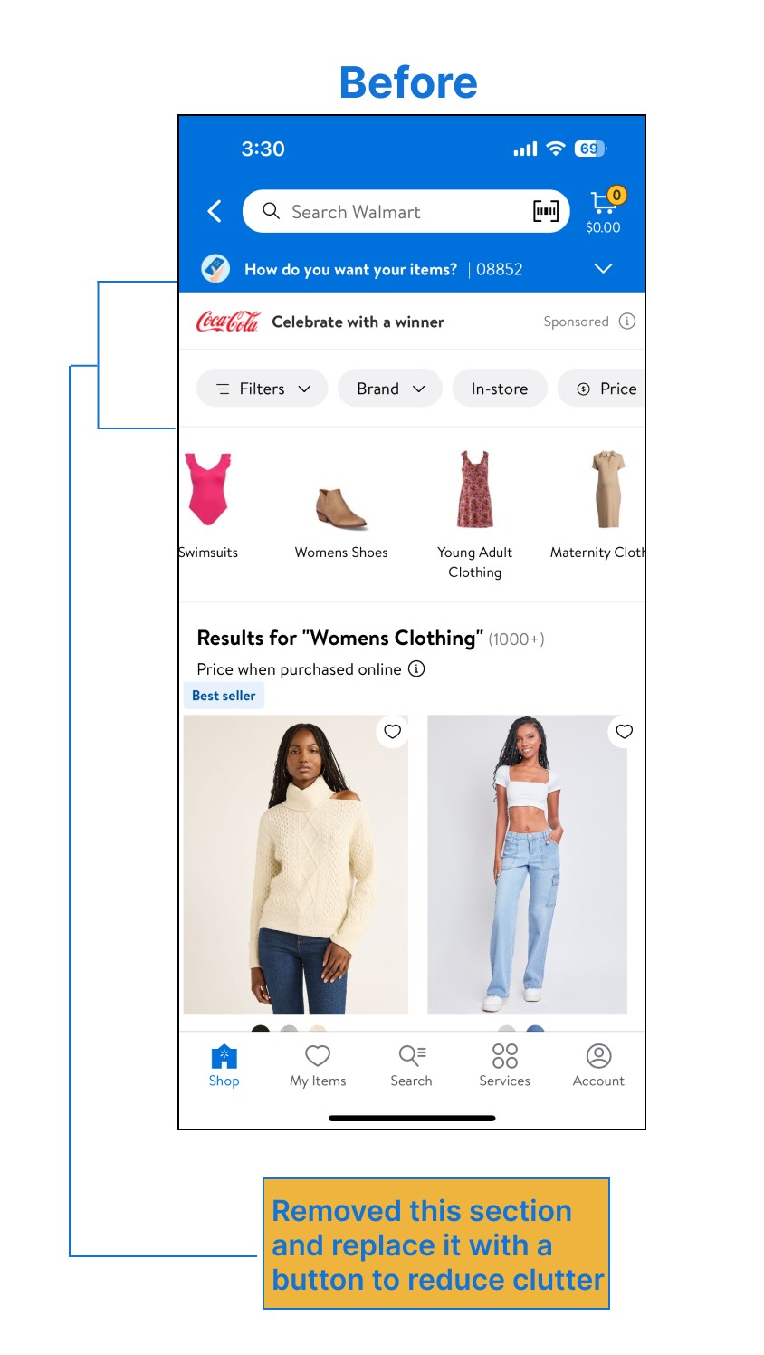


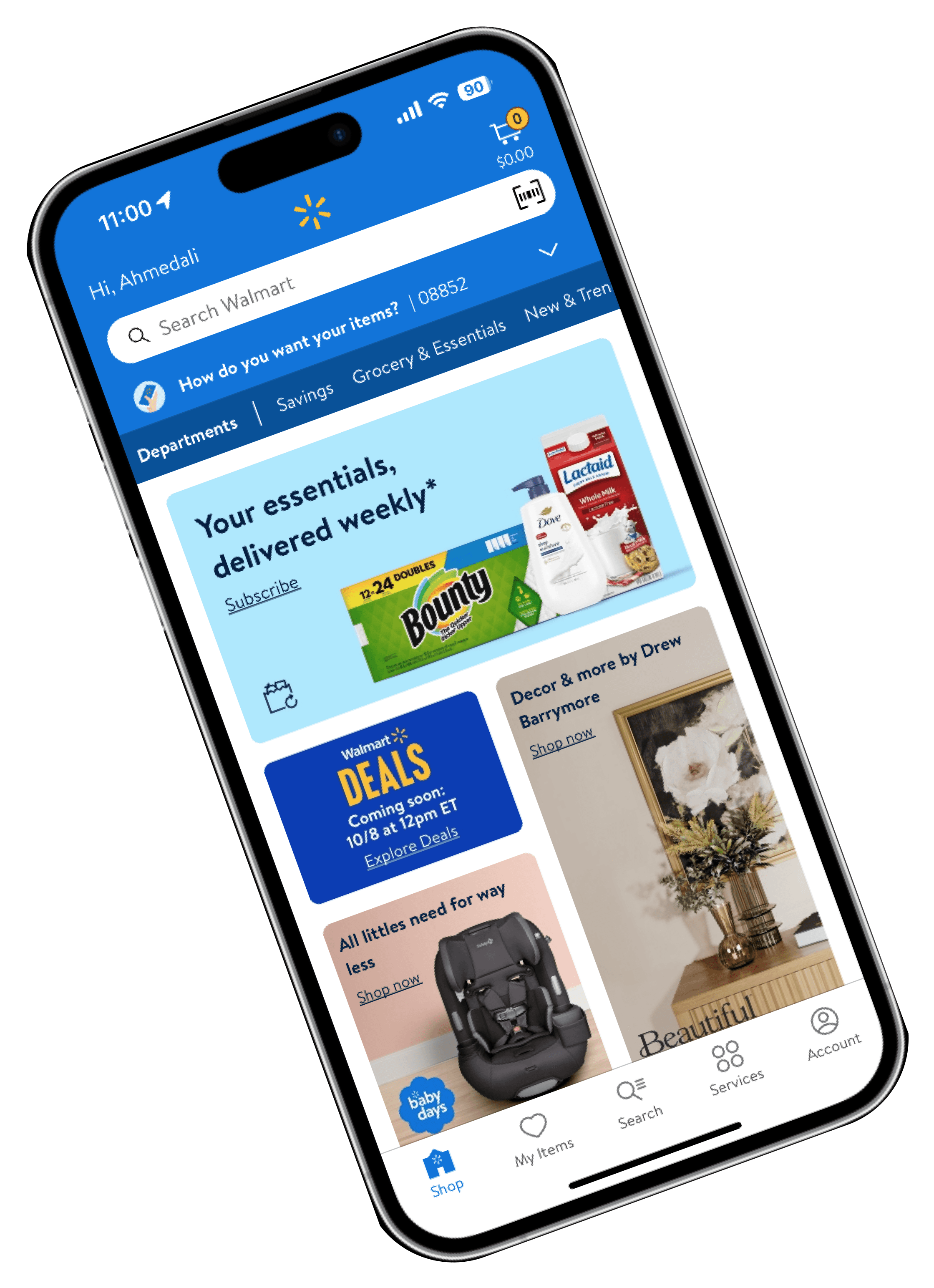
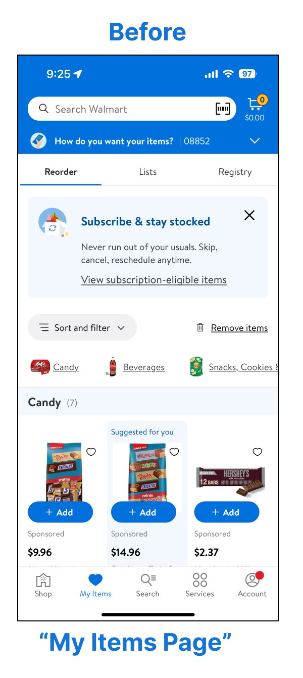
The original account page seems too crowded with an overload of information hence I created a new wallet section and replaced the “My items page “ with it as the information on this page felt a bit repetitive.


The Wallet page would provide user with the ability to scan and link their account while shopping in store. It would also provide a quick view of their account, including the top deals available to them, their Walmart cash availability and an opportunity to sign up for Walmart+ to avail maximum discounts and view their fav items for quick reorder.
With these adjustments, my goal is to significantly enhance the overall user experience. By addressing key pain points and streamlining interactions, I aim to create a more seamless, intuitive journey for customers, whether they are shopping online or in-store. These improvements should not only reduce frustration but also foster greater satisfaction and loyalty by making the process smoother, clearer, and more aligned with user expectations. Ultimately, these changes are intended to improve usability and ensure a more positive and cohesive experience across all touchpoints.


