
KidsVille Pediatrics
KidsVille Pediatrics
KidsVille Pediatrics


Product Overview
Product Overview
Business Challenge:
Business Challenge:
Kids Ville Pediatrics is a traditional pediatric
practice who wants to gravitate towards the
modern world. The traditional methods of
handling child health records, scheduling appointments, and accessing necessary
health forms are often time consuming and fragmented causing inefficiency and
inconvenience to today's busy parents.
My Role:
Ux researcher, designer, prototyping usability study
My Role:
Ux researcher, designer,
prototyping usability study
Product Duration : 12 weeks
Project Duration:
12 weeks
Goal Statement
Goal Statement
To develop a user friendly app/website that enables parents to easily download child health forms and schedule medical appointments online. The app aims to streamline the administrative task associated with child health care, providing seamless and efficient experience for parents and health care providers.
User Research Summary
User Research Summary
User Research Summary
To understand user frustrations, needs & requirements, I conducted user research through direct interviews and user surveys for my project. I interviewed parents from different family dynamics to understand their pain points and problems faced in order to keep their children healthy. My goal was to gain insights into the needs and wants of the user so I can better design my app and responsive website.
There are two types of user research methodologies: qualitative and quantitative research. Due to time constraints I used of qualitative research.
To understand user frustrations, needs & requirements, I conducted user research through direct interviews and user surveys for my project. I interviewed parents from different family dynamics to understand their pain points and problems faced in order to keep their children healthy. My goal was to gain insights into the needs and wants of the user so I can better design my app.
There are two types of user research methodologies: qualitative and quantitative research. Due to time constraints I used of qualitative research.
To understand user frustrations, needs & requirements, I conducted user research through direct interviews and user surveys for my project. I interviewed parents from different family dynamics to understand their pain points and problems faced in order to keep their children healthy. My goal was to gain insights into the needs and wants of the user so I can better design my app and responsive website.
There are two types of user research methodologies: qualitative and quantitative research. Due to time constraints I used of qualitative research.
Personas


Emphathize

Goal: To have easy access to child's healthcare records and make
appointments hassle free.
Zarine's User Journey
By creating user Journey maps, I wanted to illustrate the process of how Zarina behaves, feels, and what she thinks while accomplishing her goals to address pain points or provide moments of delight.

Goal Statement
To develop a user friendly app/website that enables parents to easily download child health forms and schedule medical appointments online. The app aims to streamline the administrative task associated with child health care, providing seamless and efficient experience for parents and health care providers.
Product Overview
Business Challenge:
Kids Ville Pediatrics is a traditional pediatric
practice who wants to gravitate towards the
modern world. The traditional methods of
handling child health records, scheduling appointments, and accessing necessary
health forms are often time consuming and fragmented causing inefficiency and
inconvenience to today's busy parents.
My Role:
Ux researcher, designer,
prototyping usability study
Project Duration:
12 weeks
Persona 1
Persona 1
Persona 2
Persona 2
Emphatize
Goal: To have easy access to child's healthcare records and make appoinments hassle free

By creating user Journey maps, I wanted to illustrate the process of how Zarina behaves, feels, and what she thinks while accomplishing her goals to address pain points or provide moments of delight.
Zarine's User Journey
Emphatize
Goal: To have easy access to child's healthcare records and make
appointments hassle free.
By creating user Journey maps, I wanted to illustrate the process of how Zarina behaves, feels, and what she thinks while accomplishing her goals to address pain points or provide moments of delight.
Zarine's User Journey
Ideate
Ideate
Ideate
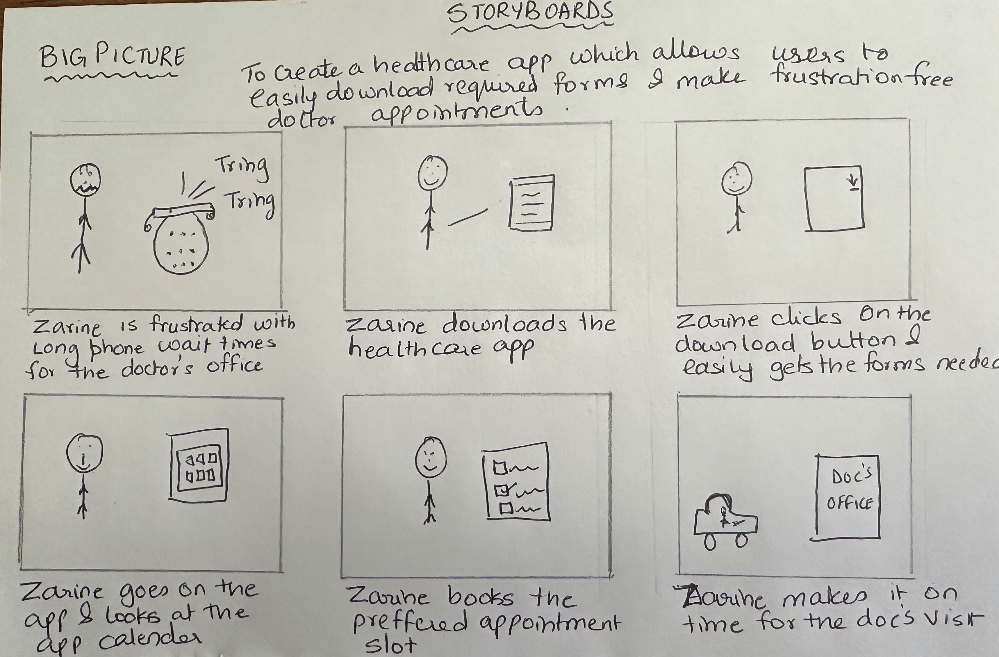
Big Story Board
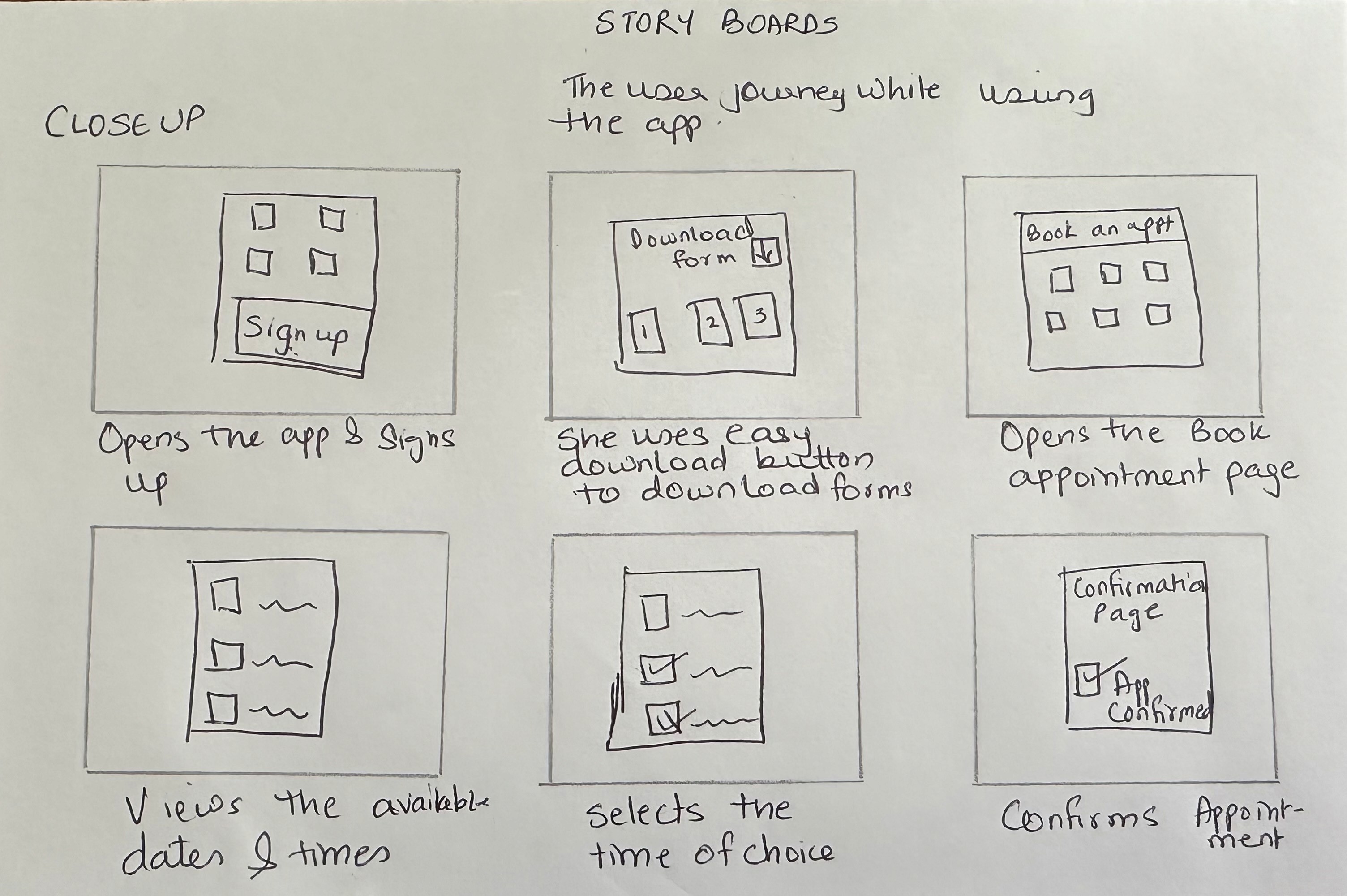
Close up Story Board
My Design Thinking Process
My Design Thinking Process
My Design Thinking Process
Emphatize
User Research
User Interviews
User Surveys
Secondary research
Define
User Stories
User Personas
User Journey Maps
Brainstorming
How might we Q's
Rapid Sketching
Competitive Audit
Ideate
Info Architecture
Wireframe
Lo-Fi Prototype
Hi-Fi Prototype
Prototype
Usability Testing
Affinity Diagrams
Iterations
Test
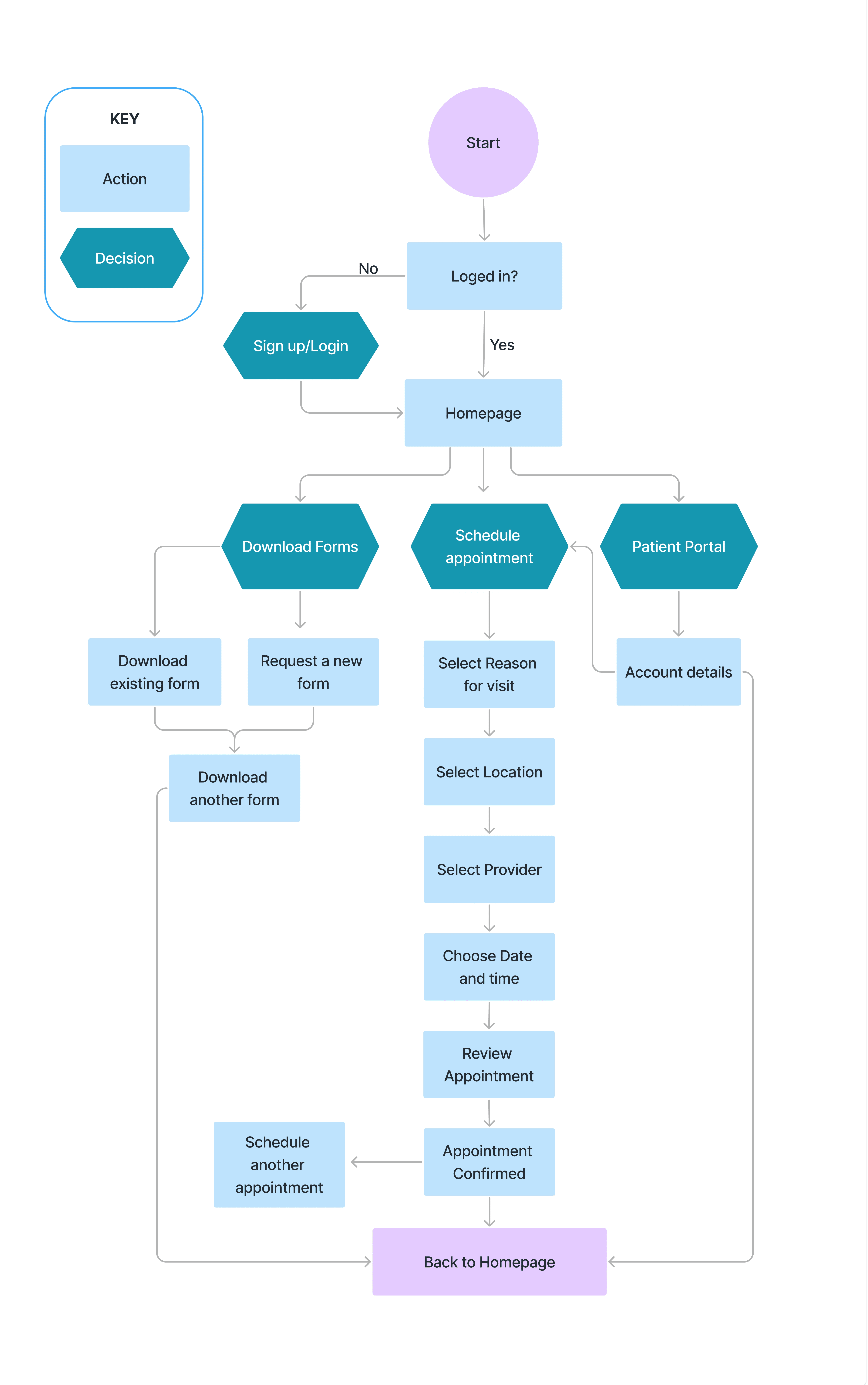
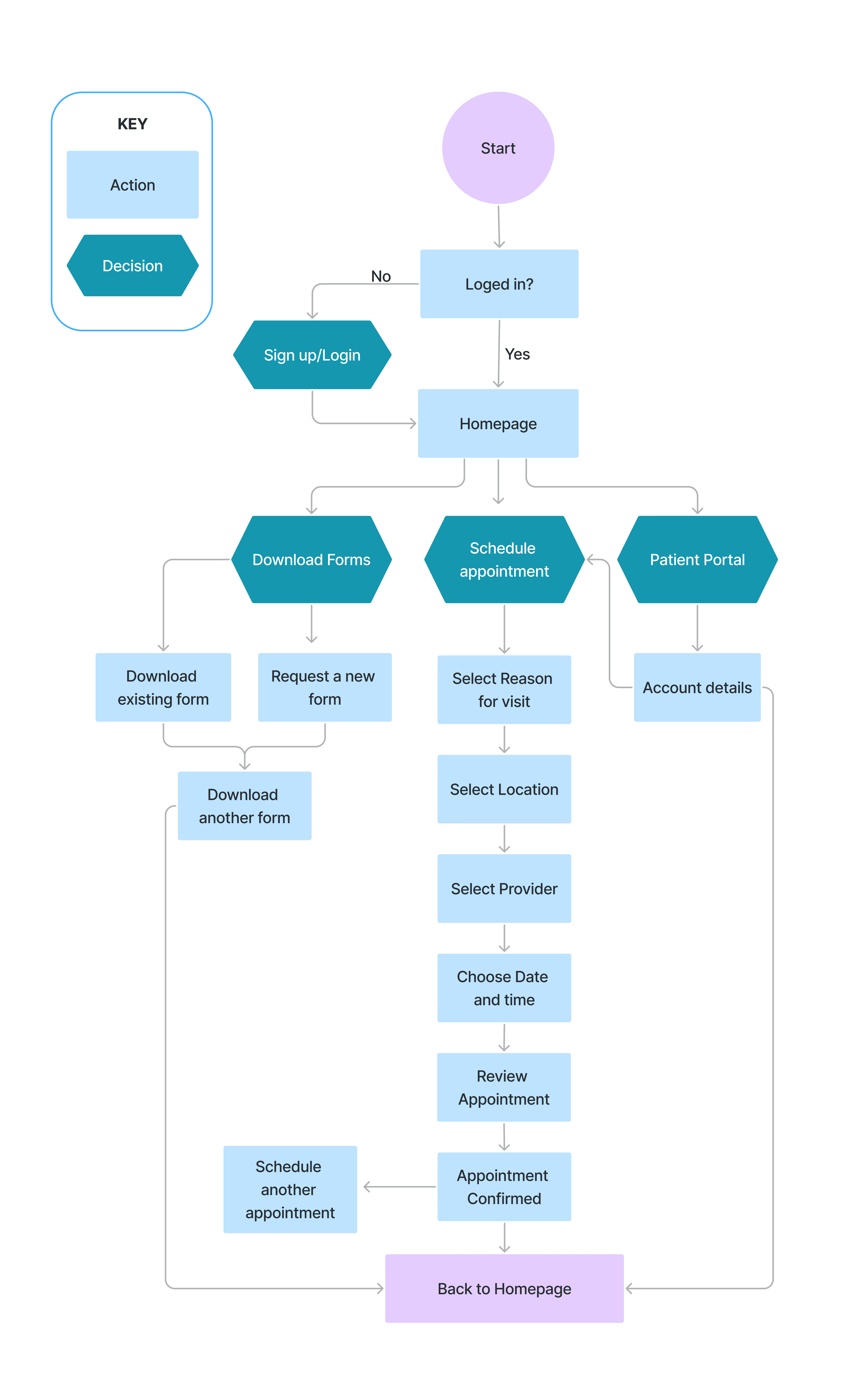
Flow Chart
Flow Chart
Flow Chart
Paper Wireframes
Paper Wireframes
Paper Wireframes
Focusing on the core features identified during the user research, I sketched the first wireframes using pen and paper.
I created the list of all the important things that needed to be added in the wireframes like nav bars, scheduling buttons, download form button, user profile page etc. using these as base, I created five different versions of wireframes.

Digital Wireframe
Digital Wireframe
Digital Wireframe
After many iterations, using the best features from all the paper wireframes, I created a digital wireframe that would highlight the CTA button and present all the important information on the homepage itself.

Homepage with upfront scheduling & download form button for easy CTA
Homepage with upfront scheduling & download form button for easy CTA


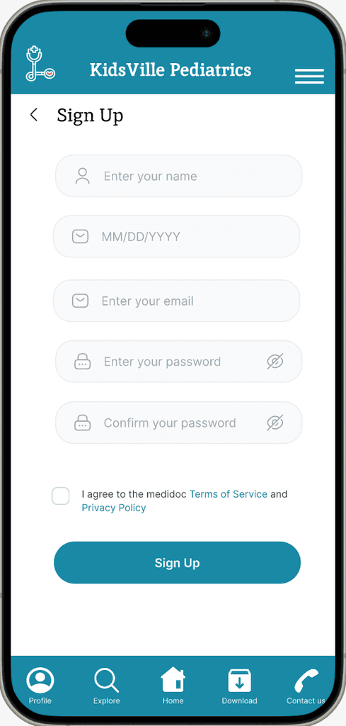
Simple login/sign up page.

Patient portal for easy access to all records
Scheduling Page
Scheduling Page
Scheduling Page
With the help of user research, I also designed the additional pages in order to ease out the user journey and showcase the navigation path in order to complete the user task.

Scheduling page to select the location, type of visit and the preferred doctor

Basis the location & the provider, choose the date & time as per convience.

Created a confirmation page to confirm appointment.
Download forms Page
Download forms Page
Download forms Page

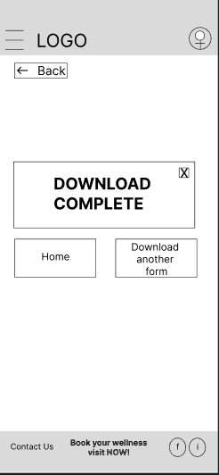
Dedicated page to download pre specified forms
Dedicated page to download pre-specified forms
Dedicated page to download pre-specified form
Lo-Fidelity Prototype
Lo-Fidelity Prototype
Lo-Fidelity Prototype
I created a low fidelity prototype from the user flow diagram and wireframes to test functionality before incorporating it into the final design and to ensure accessibility for the end users.


User Testing
User Testing
User Testing
We conducted a usabilty study on our low fidelity prototype using 5 different participants using the user sample study mentioned below.
We conducted a usabilty study on our low fidelity prototype using 5 different participants using the user sample study mentioned below.
We conducted a usabilty study on our low fidelity prototype using 5 different participants using the user sample study mentioned below.

Study Findings
Study Findings
Study Findings

Affinity Diagrams
Affinity Diagrams
Affinity Diagrams
The participants were given 3 prompts to test:
1) To create an account or log in
2) To schedule an appointment
3) To download a health form of choice
Based on their reactions we created the affinity diagram below.
The participants were given 3 prompts to test:
1) To create an account or log in
2) To schedule an appointment
3) To download a health form of choice
Based on their reactions we created the affinity diagram below.
The participants were given 3 prompts to test:
1) To create an account or log in
2) To schedule an appointment
3) To download a health form of choice
Based on their reactions we created the affinity diagram below.
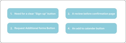
User Pain Points
User Pain Points
User Pain Points
Through testing the five participants and analyzing common themes, four specific pain points were identified
Through testing the five participants and analyzing common themes, four specific pain points were identified
Conclusion
Conclusion
Conclusion
Finding 1
Users couldn't find the sign up button easily. They had to hunt around the homepage to figure out where they could sign up.
Action Needed:
A log-in/sign-up pop up on the homepage would be helpful.
Users couldn't find the sign up button easily. They had to hunt around the homepage to figure out where they could sign up.
Action Needed:
A log-in/sign-up pop up on the homepage would be helpful.
Users couldn't find the sign up button easily. They had to hunt around the homepage to figure out where they could sign up.
Action Needed:
A log-in/sign-up pop up on the homepage would be helpful.
Finding 2
Users pointed out that not all forms were listed on the download form page. Hence wanted a search and request form option on the download form page.
Action Needed:
Create a "Request Form" form to allow users to avail additional forms.
Users pointed out that not all forms were listed on the download form page. Hence wanted a search and request form option on the download form page.
Action Needed:
Create a "Request Form" form to allow users to avail additional forms.
Users pointed out that not all forms were listed on the download form page. Hence wanted a search and request form option on the download form page.
Action Needed:
Create a "Request Form" form to allow users to avail additional forms.
Finding 3
Users were baffled that the appointment got confirmed without offering a review page to check the appointment details.
Action Needed:
Create a review page with appointment details, before confirming the appointments.
Users were baffled that the appointment got confirmed without offering a review page to check the appointment details.
Action Needed:
Create a review page with appointment details, before confirming the appointments.
Users were baffled that the appointment got confirmed without offering a review page to check the appointment details.
Action Needed:
Create a review page with appointment details, before confirming the appointments.
Mock Ups
Mock Ups
Mock Ups
Based on the insights from the usability study, I applied design changes. I added a login/sign up pop up on the homescreen.
Based on the insights from the usability study, I applied design changes. I added a login/sign up pop up on the homescreen.
Based on the insights from the usability study, I applied design changes. I added a login/sign up pop up on the homescreen.
Before
After

Created a log-in popup for easy sign up
Before
After

Created a contact us form for additional form request
Prototyping in Figma
Prototyping in Figma
Prototyping in Figma
After finalizing the lo-fi wireframes, I worked on the final designs with the goal of making them simple and intuitive. The main color theme I used was blue to invoke a sense of trust in the users.

Style Guide
Style Guide
Style Guide

Accesibility Consideration
Accesibility Consideration
Accesibility Consideration
When choosing the color palette, I made sure the primary colors met the WCAG AA compliance before building UI for each screen.
I am using two types of typefaces:
Inika for headlines and Inter for body copy. Both are clear and sized appropriately to make them easy to read.
I am using two types of typefaces:
Inika for headlines and Inter for body copy. Both are clear and sized appropriately to make them easy to read.
I implemented the hierarchy through out the app. This helps user distinguish the different sections and information on the screen.
Going Forward
Going Forward
Going Forward
Takeaways
Takeaways
Takeaways
Impact:
People are still cautious about using digital medical services as a health is crucial aspect of our lives. In effort to address this issue, I created a platform that offers various features. The design of this platform was a challenge as its target audience is broad ranging from 18-65. It is important to understand the problems faced by the user in order to make it a user friendly app.
Impact:
People are still cautious about using digital medical services as a health is crucial aspect of our lives. In effort to address this issue, I created a platform that offers various features. The design of this platform was a challenge as its target audience is broad ranging from 18-65. Is is important to understand the problems faced by the user in order to make it a user friendly app.
What I learned:
As a UX designer working on a health care platform, I have gained valuable insights and knowledge through the design process. Some of the key things I learned includes:
Understanding the users' needs
Importance of simplicity
Accessibility considerations
User feedback
What I learned:
As a UX designer working on a health care platform, I have gained valuable insights and knowledge through the design process. Some of the key things I learned includes:
Understanding the users' needs
Importance of simplicity
Accessibility considerations
User feedback
Next Steps
Next Steps
Next Steps
Obtain feedback from UX/UI designers with more experience in the field.
Obtain feedback from UX/UI designers with more experience in the field.
After documenting all the feedback provided, I will make the necessary design updates in order to improve the app's overall experience
After documenting all the feedback provided, I will make the necessary design updates in order to improve the app's overall experience
Create cross platform responsive design. The goal is to build the same user experience for all users, no matter what type of device they use.
Create cross platform responsive design. The goal is to build the same user experience for all users, no matter what type of device they use.
Conclusion
Conclusion
Conclusion
I would appreciate your thoughts and insights on this topic, as feedback is crucial to further enhance the findings of this study.
If you like my work, feel free to reach me on:
Email: tassingaporewala@gmail.com
Phone: 917-250-2716
I would appreciate your thoughts and insights on this topic, as feedback is crucial to further enhance the findings of this study.
If you like my work, feel free to reach me on:
Email: tassingaporewala@gmail.com
Phone: 917-250-2716
I would appreciate your thoughts and insights on this topic, as feedback is crucial to further enhance the findings of this study. If you like my work, feel free to reach me on:
Email: tassingaporewala@gmail.com
Phone: 917-250-2716
Check out more of my work
Check out more of my work
Check out more of my work


Thank you for your interest in my work. Let's Connect!
Thank you for your interest in my work. Let's Connect!
Thank you for your interest in my work. Let's Connect!


Made with masala-papad + chai.
Made with masala-papad + chai.
Made with masala-papad + chai.

Tasneem Singaporewala
Tasneem Singaporewala
Tasneem Singaporewala